visual identity / web design
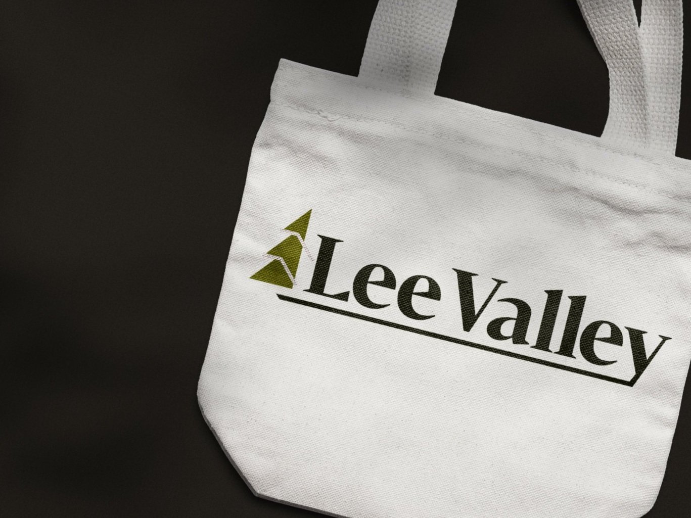
LEe valley tools
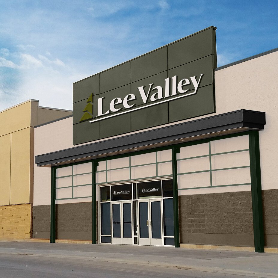
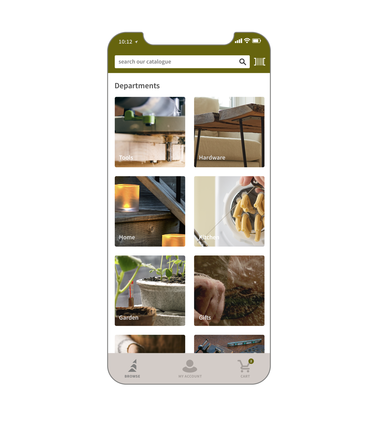
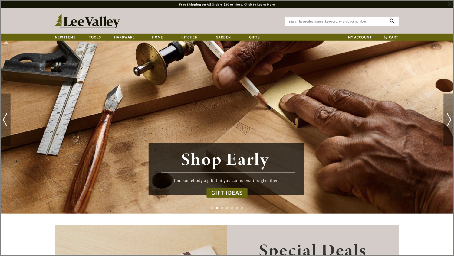
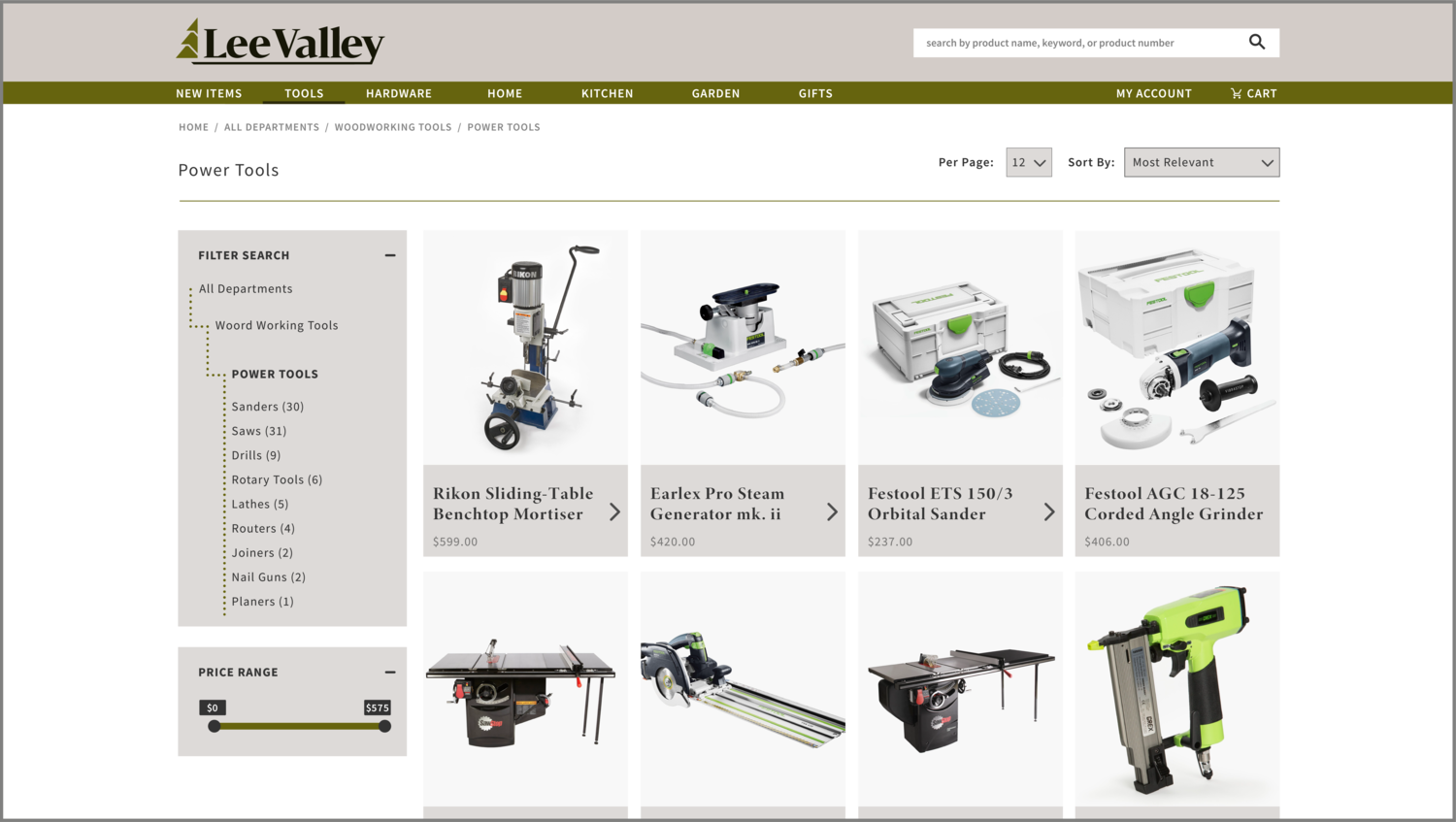
In building this new identity for Lee Valley, my primary intention was to unify the brand’s various assets and motifs which have slowly been created over the brand’s 30+ years of operation. Upon implementation, the brand will also be able to grow out of their stagnant position within an increasingly saturated market.
Lee Valley remains a family operated business that values craftsmanship and customer service above all else–this is something I felt was necessary to carry over into the brand’s revitalized corporate identity.
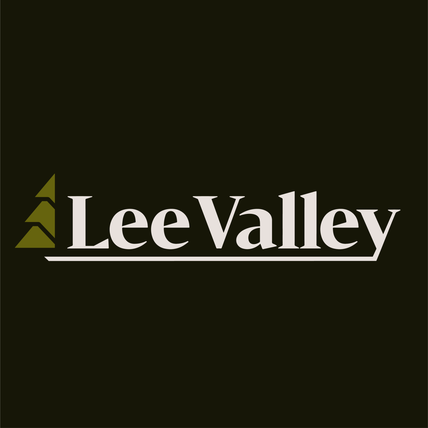
I chose to utilize a robust, geometric-feeling serif to reinforce the brand’s stability, as well as to reflect imagery of chiseled forms due to the company’s place in the hardware market.
I opted to stay true to the forest green and off-white most often associated with the company as not to deviate the company too far away from its already-established audience.