

visual identity / package design
red rose tea packaging refresh
For this project I was tasked in evaluating a brand with longstanding customer equity which had room for updates in their visual identity. Then, I proceeded in developing a new approach to both their branding and their packaging to attract new customers without losing the loyalty of their standing customer base.
Red Rose Tea Canada has been in operation for over a hundred years, and throughout that time have only made very subtle changes to their various design assets–and for good reason.
Their customer base grows more so via word of mouth rather than by shelf appeal. With that in mind, the world of tea is growing rapidly, presenting the opportunity for Red Rose to become the tea of choice for an entirely new generation of tea drinkers by means of a newfound shelf appeal.
By adopting a consciously updated brand identity such as the one presented below, I propose that the company will stand a higher chance at attracting a new, younger customer base, without scaring away their already-established customer base.

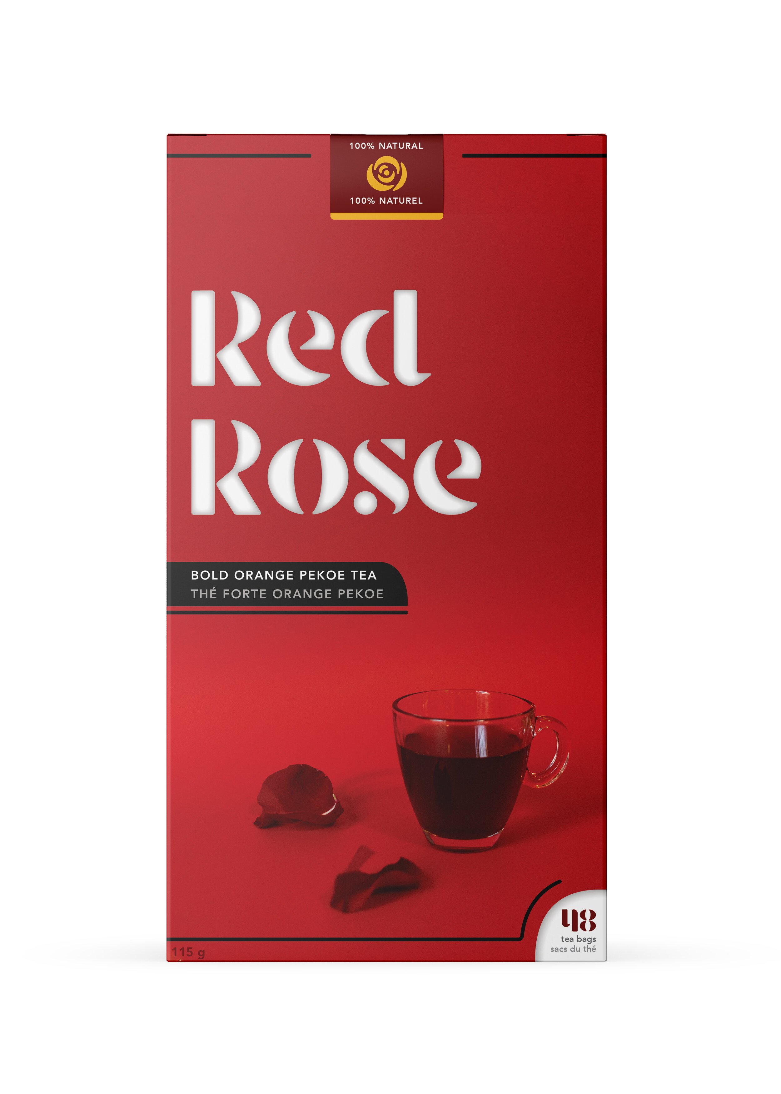


The Visual Approach
The direction we took this design changed a fair bit throughout the creative process as we sought a balance between an identity that wouldn’t deter the elderly audience who already consumes this tea, and one that would present an immediate initiative for new customers to pick up the package off the shelf.
We found that this geometric-stencil typeface, modified to appear less sharp, read traditional enough at a glance while still containing a great deal of visual interest. This visual interest would thus present a modernized version of the brand’s essence, allowing it to stand out in the grocery store. We carried this motif into my redesign of the brand’s iconic logo that can be seen atop the box, as well as on the pull tab used to open the box, furthering the consumer’s interaction with the brand.
